Using Graphs, Charts, Tables or Other Visual Aids In a Research Paper Guidelines:
1. Tables, graphs, and charts MUST BE STUDENT-GENERATED. This means that students may NOT simply copy and paste. The graphic/visual aid must be produced by the student and based on information gathered by the student or researched by the student.
2. Tables, graphs, and charts must be accompanied by an explanation in the paper. References should precede (come before) the visual aid/graphic and explain or analyze the information contained in the graphic/visual aid.
3. All resources used in creating the student-generated visual must be properly annotated beneath the graphic. Consider the following:
• Every student is REQUIRED to include a visual component in his/her research paper.
• Visual components may be one of the following: diagrams, charts, graphs, maps, or artistic renderings (such as a drawing, sketch, floor plan).
• Visual components MUST be original (i.e. student created). The visual component may not be a photocopy of a visual element taken from another source.
• The visual component must be used by the student to compile information researched from various sources and then placed into a student-generated/created visual (chart, graph, table, diagram, map, sketch, etc).
• The visual component must be incorporated into the paper close to the text that clarifies and analyzes it. In other words, it cannot be attached at the end of the paper.
• The visual component must reference material introduced and explained within the text of the paper.
• The visual component should be no larger than ½ of the page size and no smaller than ¼ of the page size.
• Most word processing programs contain tools to assist in preparing and placing a visual component directly within the text of the paper. Basic Rules: Graphics, often called figures, make technical information clearer by presenting it in a visual way. There are simple guidelines to use to generate and present graphics in formal papers and essays. Some tips are:
• Make sure that the graphic or figure corresponds to the topic and overall thesis or purpose of your essay/paper.
• Keep your graphic simple. It should illustrate one idea – and the reader/audience should be able to understand the idea immediately.
• Use as few words as necessary in graphics. A title, labels, scales, numbers, statistics, and essential information are all that should be included in addition to the statistics. • The graphic should add to the purpose of the paper and should be discussed within the text. The most common graphics found in papers/essays are:
• Tables
• Graphs
• Pie charts
• Bar chart
BULLET POINTS DO NOT COUNT AS THE “VISUAL” ELEMENT REQUIRED FOR THE GRADUATION PROJECT.
NOTE: The following samples of graphics are professional examples, not examples of student-generated models.
NOTE: All the examples do not have titles. Your tables/graphs should have titles.
NOTE: The examples do not have a SOURCE listed. This should be listed at the bottom of the chart: Source:
Tables
Tables are used to categorize and compare large amounts of information. A table should not be constructed unless repetitive data must be presented. If only a few items of data are presented, explain them in text rather than in a table. Guidelines for using tables are:
• Tables have both left and right (horizontal) dimensions and up-and-down (vertical) dimensions. Ideally, tables must read down a column, not across rows. However, much will depend on the purpose of the table.
• Words in a column must be lined up to the left (left justified).
• Numbers in a column must be right justified, or lined up along the decimal point.
• Limit the range values shown in the table. If the values of variables do not change much, group the data into ranges.
• Give each column a clear heading, which must be understandable without reference to the text or any footnotes to the table.
• Separate column headings or totals from the rest of the table using a thin horizontal line.
• Break vertical lists by a line space every few lines.
• Use vertical space, rather than solid lines, to divide columns.
• If you have placed a table in your paper, make sure that you have referred to it in the text of your paper.
Graphs
Graphs can be used to show how variables relate to each other. Guidelines for preparing and using graphs in research papers are:
• Make connecting lines clear and easy to distinguish from other lines on the graph.
• Use a legend to explain what each of the lines represents and set the legend away from the data lines for ease of reading.
• Do not extend the horizontal (x) or vertical (y) axes beyond what is necessary to include your data. If your data ranges in value from 0 to 46, consider having the axis between 0 and 50, but not more than that.
• If there is more than one line in a graph, choose colors or marks that make the lines easy to distinguish from each other.
• Avoid using graphs that only show one curve or line. If it does, it might be better to describe in words, rather than in a graph.
• Use graphs that illustrate your message in an interesting way. If it does not look interesting, do not use a graph.
• If the precise values are important, use a table instead of a graph.
• Avoid using graphs if the data you are presenting is sparse or repetitive.
Pie Charts
Pie charts are used to show proportions and the relationship of proportions. Guidelines for using a pie chart in research papers are:
• Limit the number of slices shown in the pie chart to no more than five.
• Ensure that the color/pattern for each slice is distinct from all other slices. Each slice must be clearly labeled.
• The difference in slice sizes must be obvious.
• Start the arrangement of slices at 12:00 on the chart and arrange slices clockwise in decreasing order of size.
• Provide a legend so the reader can easily grasp what each slice represents.
• Set legends away from the chart. • Provide a title for the chart and any explanatory notes – but keep to a minimum.
• If the precise values are important, consider using a table to show the data instead.
Bar Charts
Bar charts are used to show trends and variations. A histogram is a specialized form of a bar chart used to show frequency distributions of data. Guidelines for using bar charts in research papers are:
• Limit the number of items you are comparing.
• Label both the x and y axes clearly and indicate the units of measure.
• Keep the scales consistent (draw as accurately to scale as possible).
• Place the bars next to one another for continuous trends and farther apart for discontinuous ones.
• Legends should be set away from the data.
• Label the chart and provide a title.
• Consider whether the bars look better vertically or horizontally. A chart that is wider than is tall probably gives the best overall effect.
• Avoid using bar charts if the data you are presenting is sparse or repetitive.
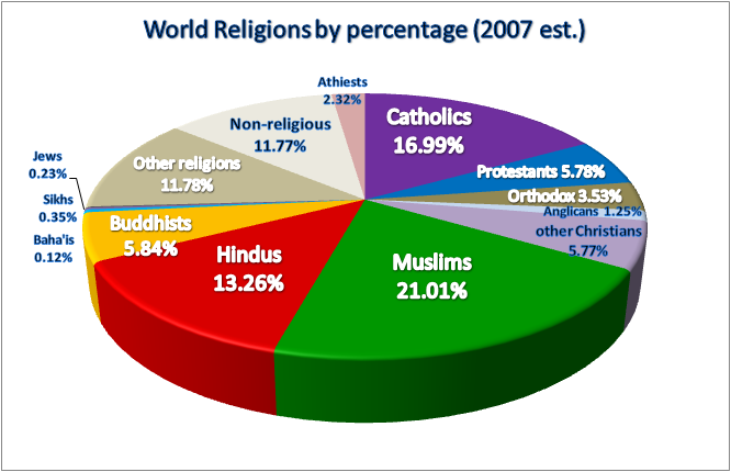
Pie Chart
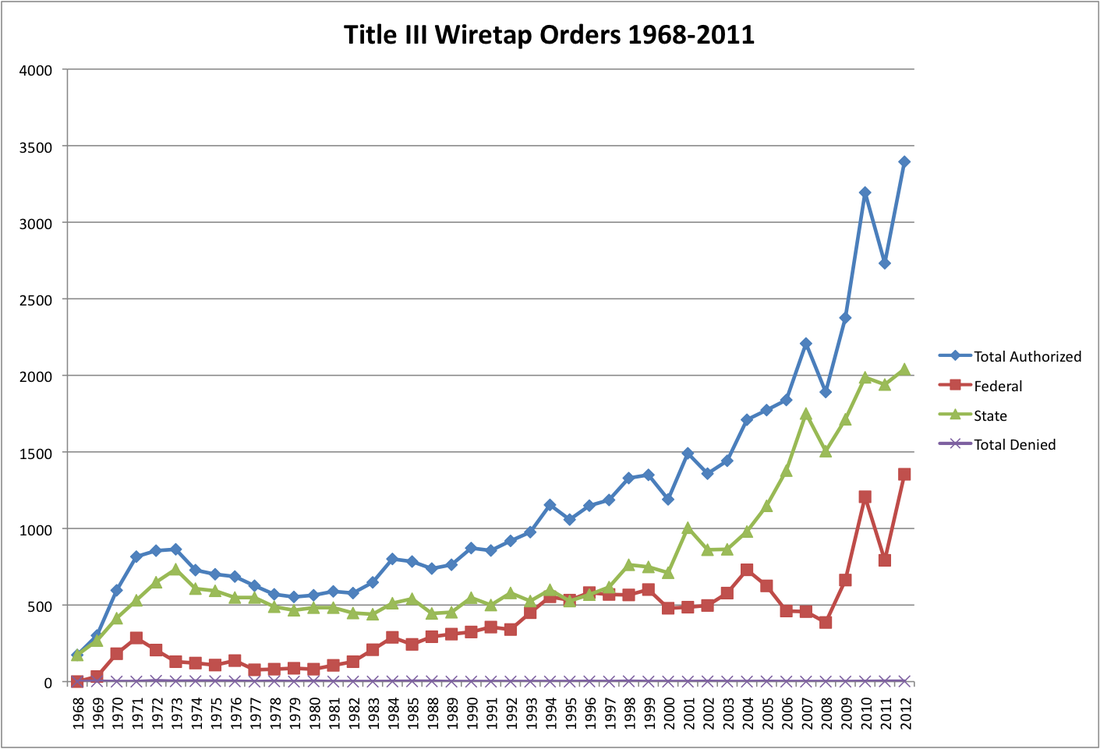
Line Graph
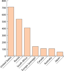
Bar Graph
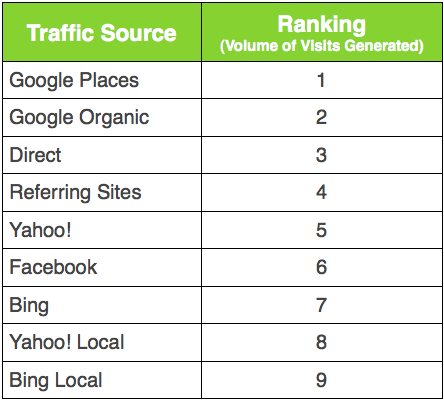
Table
